Showing posts with label design for print. Show all posts

Saturday, 12 November 2011

Print//packaging


I like how these designs become sophisticated through simplicity. The blank space on the labels make the products effectively stand out.

Print//packaging


I love the simplicity of the labeling for this honey. It's kept the purity of the product which I think makes it a lot more appealing. Although the label is quite dark & bold because of the shape, size and empty space it communicates effectively.

With simple packaging like this I'd say it really stays true to the function of design. It's clear and visually appealing.

Print//Packaging


Nice use of pastel colours with the brown paper stock for the minimalistic design. Simple, functional and quite fun.

Print//packaging


Another example of minimal design for packaging. Both the colour and the text makes it a fun set of products.

Print//minimal design


 Again, effective concept. I like the use of colour with the simplistic circular shapes. For the print brief I definately want to look into using colour/pattern/shape to define each product from the range. It's easy to understand and looks visually pleasing as collective design.


Print//minimal packaging


What i like about these design is that they're simple and clear. I aim to achieve this within my designs as i think they effectively communicate with the audience, with simple lettering and colour.

Tuesday, 8 November 2011

print: RESOLUTION

the resolution of your design all depends on how much information the file contains.

pixel depth is another factor that effects the resolution. the greater the bit depth, the more colours there are that become available and therefore improve the quality of your image.

it's important to have an understanding of the relationship between pixel dimension and print resolution in order to print your design in the highest quality.


Monday, 7 November 2011

print: file types

FILE TYPES
every printer is different which makes it really important to send off the designs in the right file format. the standard file types tend to be a PDF, EPS, JPEG and TIF.


the adobe Portable Document Format (PDF) is the standard file format for print and proofinf unless specified otherwise. photoshop, in comparison to illustrator, acrobat & indesign, works slightly different & it's sometimes good to flatten the layors.


print: stock

how its made:
paper is made from cotton, pressed pulp wood or recycled paper.

weight:
the weight of stock is a description of the density of fibers that make up the paper. the weight of the stock is measured in grams per square meter. something to take into consideration is that usually, the heavier the paper the longer the stock will last as it's more durable.

thickness:
this is measured in caliper (inches) or millimeters. the thickness does not effect the quality of the stock 

colour:
to do this the fiber pulp is dyed before pressing. these are more expensive then white paper. there are bright, parchment, and pastel shades, along with metallics.


texture:
this depends on the manufacturing process as well as the size & quality of the wood fibers. if the paper is tightly pressed with fine fibers the paper has a smoother finish. less pressed stock with larger fibers results in card/board.
Laid: machine-made paper with a pattern of parallel lines. 
Vellum: a paper finished to appear like the writing material vellum, which may be either prepared animal skin or parchment, i.e., a slightly rough finish. 
Linen: a paper finished to appear like linen, a woven cloth that can be used as canvas. 
Felt: paper that is textured by being pressed with patterned wool or felt during the manufacturing process. 
Embossed: a paper with a raised design created by pressing or hammering the design onto its back.

opacity
this refers to the density and thickness and it's measure on how much image and text can be seen on the reverse. tracing paper is created by immersing quality paper into acid.

finishes
varnish coating
the varnish can be applied with the inks or as a separate run and keeps the inks intact
matt, satin & gloss
the quality of the paper determines the intensity of the ink and there's quite a difference when comparing matte & gloss. printed onto matte paper, ink sinks into the paper creating a more dull looking finish where as the ink sits on the surface of the gloss stock therefore making the ink appear more intense and deeper in appearance. satin allows for slightly less intense colours then gloss but it doesn't have the shine.

Sunday, 6 November 2011

developing kit


taking a look at what developing kits are out there at the moment. in order to promote the use and development of photographic film i'll definately look into how to re-design kits such as these. although they may be functional, they're not persuasive in their visual design.

Kit contents:

Color Developer Part A - 50ml highly concentrated
Color Developer Part B - 50ml highly concentrated
Color Developer Part C - 50ml highly concentrated
Bleach - 140ml
Fixer - 100ml
Starter - 10ml
Stabilizer - 25ml


more kit designs:


Tuesday, 25 October 2011

Paper size

A Sizes (mm)
B Sizes (mm)
C Sizes (mm)
4A0
1682 x 2378


2A0
1189 x 1682


A0
841 x 1189
B0
1000 x 1414
C0
917 x 1297
A1
594 x 841
B1
707 x 1000
C1
648 x 917
A2
420 x 594
B2
500 x 707
C2
458 x 648
A3
297 x 420
B3
353 x 500
C3
324 x 458
A4
210 x 297
B4
250 x 353
C4
229 x 324
A5
148 x 210
B5
176 x 250
C5
162 x 229
A6
105 x 148
B6
125 x 176
C6
114 x 162
A7
74 x 105
B7
88 x 125
C7
81 x 114
A8
52 x 74
B8
62 x 88
C8
57 x 81
A9
37 x 52
B9
44 x 62
C9
40 x 57
A10
26 x 37
B10
31 x 44
C10
28 x 40


All paper sizes have specific measurements and it's a crucial part of your design that needs to be sent through the printer properly.

TARGET

I found the trip to Target really interesting and it's given alot more confidence with the print process. Seeing the printers infront of you really helped with my understanding of print. Target had a large lithography printer which uses CMYK. It's a 6 colour printer allowing for two more spot colours. 


It was also really interesting to see how the flyers etc were sectioned and cut. It showed me that alot of thought process would have to go into each plate layout as it aids the efficiency of the printing process.


Monday, 24 October 2011

Colour

PANTONE
Specific spot ink colours, the PMS (Pantone Matching System)


CMYK
Cyan, Magenta, Yellow, Key (Black)
This describes the subtractive colour model used in colour printing. CMYK is contrasted with spot colours where specific coloured inks require their own printing plate.

RGB
Red, Green, Blue
This is the additive colour model that is used in design for screen. Only a select amount of RGB can be printed with CMYK, displayed in this colour chart

Design for print

Xavier Encinas' designs for 'Under the influence' magazine
Printed lithographically in CMYK with a foil finish for a sleek design. Matte stock used with a gloss cover. 


Monday, 10 October 2011

Print & Stock


Production: MVSICA Sleeve Design & Packaging
Design: Sawdust

I really enjoy the concept of this design. By using a simple card like stock, these would have been digitally printed using foiling to aid the concept. Overall I'd say the design is fun and effective.


Production: Askul Packaging Development
Design: Stockholm Design Lab

This minimalistic design for batteries is effective with form following function. Seeing as it's made of aluminium I assume the design process is screen printing. 


Maggie Ramadani: Max Chocolatier

This different printing technique involves chocolate transfer sheets where you can actually print type onto the product. I thinks it's a really nice touch that bring the branding together.


Client: Laura Wellington
Project: Brand identity
Concept & Design: Golden
Production: Timothy Bone

Here's a good example of the Die Cut process. I like the simple use of card stock with almost a matte finish. I feel the simplicity creates a sophisticated finish.


Tuesday, 27 September 2011

Publishing & Editorial


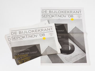
Base Design wanted to bring classical music to life when creating an identity for De Bijloke, a Belgium music centre. Base design turned something that’s not necessarily considered young and contemporary into something current and appealing. 

 I particularly like the use of vibrant yellow on the desaturated photograph as it sits well on the design.

Monday, 26 September 2011

Packaging & Promotion


This piece of packaging and promotion is effective as they've managed to create a certain character to the company. 

Branding & Identity

What is brand? – The perceived emotional corporate image as a whole.
What is identity? – The visual aspects that form part of the overall brand.
What is a logo? – A logo identifies a business in its simplest form via the use of a mark or icon.


When looking at the work on ‘September Industry’ I came across Moving Brand’s work for All About Tea. It’s a perfect example of taking something every day, such as tea, and turning into a desired and a sophisticated product. 

The logo has clearly been given thought as, although is simple, it’s appropriate to the given brief. Its effectiveness comes through simplicity. The chosen use of metallic for the packaging creates a sophisticated looking product. Finally the type used on the posters are contemporary and compliment the designs. Overall I feel it’s a successfully delivered brief.


  I came across this student's packaging for the Ilford 120 film. This piece of design directly relates to my chosen 'good' and so it's interesting to see how another student has handled it. It reintroduces and encourages the use of analog film technologies as a pinhole camera.


I really like Jack Crossing's vinyl work for Noir Blanc. I think it's the combination of the photographs/images with the triangular shaping that really appeals to me. All of the designs are crisp and visually engaging. The type fits in nicely with the finished look of the vinyls too and overall this work really inspires me. 

I find it really interesting looking at different identity briefs and how they mould and shape the individuals work. Jack Crossing seems to do this really well with this work. The final designs look expensive and sophisticated.


 I really like Anagrama’s designs for El Vivero, mainly because I feel it’s a piece of contemporary design that was intended to reflect the new, young audience of the business. With the chosen vibrant colouring and the simplistic layout, they have created a sophisticated and modern piece of graphic design which ofcourse is something I aim to achieve in my work. They wanted to keep the designs 'fresh' and I'd say it's definitely achieved with the combination of the layout, text and blank space. 


This is a distinctive new piece of brand identity by Golden. I really like the choice of stock for this piece of brand identity as not only is it appropriate but it denotes sophistication.