Monday 27 February 2012
more Matthew Shlian
I came across some of Matthew's older work and thought that this light book was a strong idea that could fit into the exhibition really well. Using light will explore the weights of the paper, looking at quality and transparency.
This light book measures a 8 x 8 x 1/2 inches, however, we'd be looking at a large scale within the exhibitions for impact and interaction.
This light book measures a 8 x 8 x 1/2 inches, however, we'd be looking at a large scale within the exhibitions for impact and interaction.
Sunday 26 February 2012
Movement
This video has given me several ideas for moving sculptures within the exhibition. I think this will create a vital interaction between the public and the fedrigoni paper. It also exploits the versatility of the stock. With some strong lighting with these pieces and an increase in scale they could potentially be really striking...
Matthew Shlian
Really nice cut out flip book by Matthew Shlian. Here the paper has been combined with illustration in an effective way using abstract shaping, movement and dimensions.
Richard Sweeney
Richard studied at Batley School of Art and
Design, which led him to the study of three dimensional design
at the Manchester Metropolitan University. There he concentrated on the
hands-on manipulation of paper to create design models, which ultimately
developed into sculptural pieces.
These definitely inspire me in terms of setting up an exhibition for Fedrigoni. They're quite interactive pieces in which you could walk around and really appreciate the paper crafting. It could be interesting to have a range of sculpture pieces like this using different weighted/coloured stocks.
These definitely inspire me in terms of setting up an exhibition for Fedrigoni. They're quite interactive pieces in which you could walk around and really appreciate the paper crafting. It could be interesting to have a range of sculpture pieces like this using different weighted/coloured stocks.
Friday 24 February 2012
advertisement prices
I found some prices for advertisements to be placed in a magazine HOWEVER, we must take into account that we would be a new up-coming magazine and so companies may be less inclined to place their adds in our magazine compared to other more highly-purchased magazines.
Although it's in dollars it gives us a rough idea of pricing:
Although it's in dollars it gives us a rough idea of pricing:
| FULL-PAGE | 1x | 3x | 6x | 12x | |||
| Black & White | $2,450 | $2,275 | $2,105 | $1,960 | |||
| Two-Color | $2,840 | $2,665 | $2,495 | $2,350 | |||
| Four-Color | $3,340 | $3,165 | $2,995 | $2,850 | |||
| 2/3 PAGE | |||||||
| Black & White | $1,855 | $1,755 | $1,595 | $1,485 | |||
| Two-Color | $2,220 | $2,090 | $1,960 | $1,850 | |||
| Four-Color | $2,690 | $2,560 | $2,430 | $2,320 | |||
| 1/2 PAGE ISLAND | |||||||
| Black & White | $1,620 | $1,505 | $1,395 | $1,295 | |||
| Two-Color | $1,975 | $1,860 | $1,750 | $1,650 | |||
| Four-Color | $2,435 | $2,320 | $2,210 | $2,110 | |||
| 1/2 PAGE HORIZONTAL | |||||||
| Black & White | $1,495 | $1,390 | $1,285 | $1,195 | |||
| Two-Color | $1,850 | $1,745 | $1,640 | $1,550 | |||
| Four-Color | $2,310 | $2,205 | $2,100 | $2,010 | |||
| 1/3 PAGE 1/3 PAGE VERTICAL |
|||||||
| Black & White | $1,220 | $1,135 | $1,050 | $975 | |||
| Two-Color | $1,575 | $1,490 | $1,405 | $1,330 | |||
| Four-Color | $2,035 | $1,950 | $1,865 | $1,790 | |||
| 1/4 PAGE 1/4 PAGE VERTICAL 1/4 PAGE HORIZONTAL |
|||||||
| Black & White | $1,025 | $955 | $880 | $820 | |||
| Two-Color | $1,380 | $1,310 | $1,235 | $1,175 | |||
| Four-Color | $1,840 | $1,770 | $1,695 | $1,635 | |||
| 1/6 PAGE VERTICAL 1/6 PAGE HORIZONTAL | |||||||
| Black & White | $920 | $855 | $790 | $735 | |||
| Two-Color | $1,265 | $1,200 | $1,135 | $1,080 | |||
| Four-Color | $1,670 | $1,605 | $1,540 | $1,485 | |||
| 1/8 PAGE | |||||||
| Black & White | $830 | $770 | $715 | $665 | |||
| Two-Color | $1,175 | $1,115 | $1,060 | $1,010 | |||
| Four-Color | $1,580 | $1,520 | $1,465 | $1,415 | |||
Thursday 23 February 2012
shapes & perspective


I've been looking the effect of using a 2-dimensional shape to create the illusion of a 3-dimensional image. "Perspective" in the graphic arts, such as drawing, is an approximate representation, on a flat surface, of an image as it is seen by the eye. The two most characteristic features of perspective are that objects are drawn:
/Smaller as their distance from the observer increases
/Foreshortened: the size of an object's dimensions along the line of sight are relatively shorter than dimensions across the line of sight
Friday 10 February 2012
yes
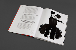
YES collaborated with Peter Saville on the art direction and design for the retrospective exhibition of Yohji Yamamoto's work.
I love the visual set up that YES has done for this collaboration. I like the simplicity of the design as it allows the Yohji's work to speak for itself as well as creating a particular 'look' for the label.

I love the visual set up that YES has done for this collaboration. I like the simplicity of the design as it allows the Yohji's work to speak for itself as well as creating a particular 'look' for the label.

Monday 6 February 2012
Subscribe to:
Posts (Atom)


