Tuesday, 25 October 2011

TARGET

I found the trip to Target really interesting and it's given alot more confidence with the print process. Seeing the printers infront of you really helped with my understanding of print. Target had a large lithography printer which uses CMYK. It's a 6 colour printer allowing for two more spot colours. 


It was also really interesting to see how the flyers etc were sectioned and cut. It showed me that alot of thought process would have to go into each plate layout as it aids the efficiency of the printing process.


Monday, 24 October 2011

Colour

PANTONE
Specific spot ink colours, the PMS (Pantone Matching System)


CMYK
Cyan, Magenta, Yellow, Key (Black)
This describes the subtractive colour model used in colour printing. CMYK is contrasted with spot colours where specific coloured inks require their own printing plate.

RGB
Red, Green, Blue
This is the additive colour model that is used in design for screen. Only a select amount of RGB can be printed with CMYK, displayed in this colour chart

Design for print

Xavier Encinas' designs for 'Under the influence' magazine
Printed lithographically in CMYK with a foil finish for a sleek design. Matte stock used with a gloss cover. 


Monday, 10 October 2011

Print & Stock


Production: MVSICA Sleeve Design & Packaging
Design: Sawdust

I really enjoy the concept of this design. By using a simple card like stock, these would have been digitally printed using foiling to aid the concept. Overall I'd say the design is fun and effective.


Production: Askul Packaging Development
Design: Stockholm Design Lab

This minimalistic design for batteries is effective with form following function. Seeing as it's made of aluminium I assume the design process is screen printing. 


Maggie Ramadani: Max Chocolatier

This different printing technique involves chocolate transfer sheets where you can actually print type onto the product. I thinks it's a really nice touch that bring the branding together.


Client: Laura Wellington
Project: Brand identity
Concept & Design: Golden
Production: Timothy Bone

Here's a good example of the Die Cut process. I like the simple use of card stock with almost a matte finish. I feel the simplicity creates a sophisticated finish.


Tuesday, 27 September 2011

Publishing & Editorial


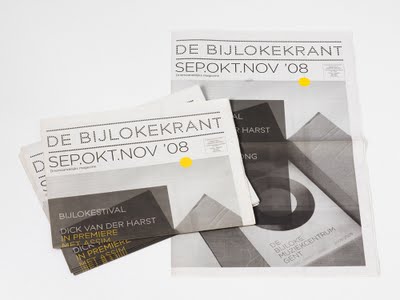
Base Design wanted to bring classical music to life when creating an identity for De Bijloke, a Belgium music centre. Base design turned something that’s not necessarily considered young and contemporary into something current and appealing. 

 I particularly like the use of vibrant yellow on the desaturated photograph as it sits well on the design.

Monday, 26 September 2011

Packaging & Promotion


This piece of packaging and promotion is effective as they've managed to create a certain character to the company. 

Branding & Identity

What is brand? – The perceived emotional corporate image as a whole.
What is identity? – The visual aspects that form part of the overall brand.
What is a logo? – A logo identifies a business in its simplest form via the use of a mark or icon.


When looking at the work on ‘September Industry’ I came across Moving Brand’s work for All About Tea. It’s a perfect example of taking something every day, such as tea, and turning into a desired and a sophisticated product. 

The logo has clearly been given thought as, although is simple, it’s appropriate to the given brief. Its effectiveness comes through simplicity. The chosen use of metallic for the packaging creates a sophisticated looking product. Finally the type used on the posters are contemporary and compliment the designs. Overall I feel it’s a successfully delivered brief.


  I came across this student's packaging for the Ilford 120 film. This piece of design directly relates to my chosen 'good' and so it's interesting to see how another student has handled it. It reintroduces and encourages the use of analog film technologies as a pinhole camera.


I really like Jack Crossing's vinyl work for Noir Blanc. I think it's the combination of the photographs/images with the triangular shaping that really appeals to me. All of the designs are crisp and visually engaging. The type fits in nicely with the finished look of the vinyls too and overall this work really inspires me. 

I find it really interesting looking at different identity briefs and how they mould and shape the individuals work. Jack Crossing seems to do this really well with this work. The final designs look expensive and sophisticated.


 I really like Anagrama’s designs for El Vivero, mainly because I feel it’s a piece of contemporary design that was intended to reflect the new, young audience of the business. With the chosen vibrant colouring and the simplistic layout, they have created a sophisticated and modern piece of graphic design which ofcourse is something I aim to achieve in my work. They wanted to keep the designs 'fresh' and I'd say it's definitely achieved with the combination of the layout, text and blank space. 


This is a distinctive new piece of brand identity by Golden. I really like the choice of stock for this piece of brand identity as not only is it appropriate but it denotes sophistication.