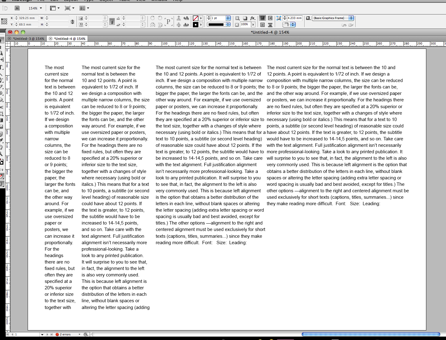
playing with font size and leading and how that effects the legibility of the type
we got into groups and decided that column 2 was easiest to read
the leading is one of the main factors that effects the legibility of the text
"The most current size for the normal text is between the 10 and 12 points. A point is equivalent to 1/72 of inch. If we design a composition with multiple narrow columns, the size can be reduced to 8 or 9 points; the bigger the paper, the larger the fonts can be, and the other way around. For example, if we use oversized paper or posters, we can increase it proportionally. For the headings there are no fixed rules, but often they are specified at a 20% superior or inferior size to the text size, together with a changes of style where necessary (using bold or italics.) This means that for a text to 10 points, a subtitle (or second level heading) of reasonable size could have about 12 points. If the text is greater, to 12 points, the subtitle would have to be increased to 14-14,5 points, and so on. Take care with the text alignment. Full justification alignment isn’t necessarily more professional-looking. Take a look to any printed publication. It will surprise to you to see that, in fact, the alignment to the left is also very commonly used. This is because left alignment is the option that obtains a better distribution of the letters in each line, without blank spaces or altering the letter spacing (adding extra letter spacing or word spacing is usually bad and best avoided, except for titles.) The other options —alignment to the right and centered alignment must be used exclusively for short texts (captions, titles, summaries...) since they make reading more difficult"

looking at how the column widths effect the legibility. the small column makes the text harder to read as you're creating pauses whilst you read it. the widest column, like that in a book, is also difficult to read as you're eye struggles to keep track of what line you're on and so its more challenging. we decided column 3 was the most legible and would be seen in magazines.
max words per line = 11-12
min words per line = 5-6
playing with fonts:

if the font size needs to be increased (without decreasing the leading) the blank lines can be removed but it must be clear where the paragraphs begin and end, like in column 2, using indents
for better readability, the tab should be about 3 characters in
you can control the 'colour' of the page my playing with the leading
including a picture meant that the font, point size and leading had to be played with in order to help the document look legible